This week in Data Science, I did not complete much in terms of the assigned tasks, but I did take a look into generating a standard distribution graph in python. I did not complete the MatPlotLib part 3 task, as I was side-tracked by creating this graph. The data I used was data collected for my physics assignment on measuring the speed of sound, however doing this graph was mostly a waste of time. I was using matplotlib to try and make the graph, however it would have been better to complete the assigned work.
I thought that the graph would be beneficial to my physics assignment to understand if there was a standard error involved in measurement, and possibly how to compensate for this. Both fortunately, and unfortunately, my method went quite flawlessly - the final average being within 6m/s of the theoretical speed of sound. This means that I can say that my method was effective, and why, but also makes it harder to analyse the data for possible flaws in the experiment - i.e. I have less smart person things to say.
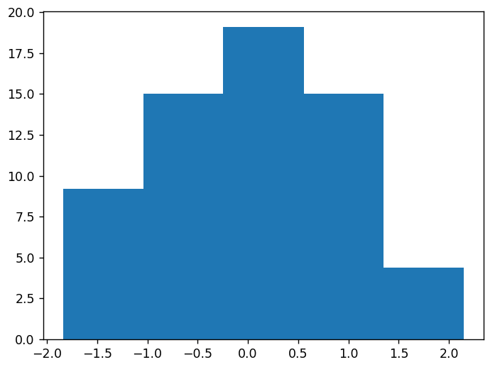
To create the graph, I first had to extract the correct data points from the .csv file. This was simple, I split the data into rows and columns, and then used a for loop to append the correct column into a list. This was the experimental speed column, which contained the raw speed from each test. The next step was to determine the standard deviation of the dataset. Numpy has a built-in standard deviation function, which is good because I do not currently have the maths knowledge to read the formula properly. Using the standard deviation, I was able to determine the z score of each value, using a for loop, and the formula (score - mean) / standard deviation. This was all the preperation for the plotting stage, for which I used a bar graph (meant to be a histogram). The graph did not fit a standard distribution at all, which (with a little help from my IT teacher), helped me to understand that 7 data points will likely never fit a standard distribution. I tried breaking the data into buckets, to see if it was even close, and I got a somewhat-standard result. This was most-likely false though as they are not really buckets, they are the standard distribution percentages mapped z score buckets. It is also not in a histogram, but uses the raw z scores for the x axes. I don’t really understand the monstrosity I created, but it is below.